Trade Show Booth Colors That Grab Attention
Standing out at a trade show is a challenge, especially at major events like CES, SEMA, or NBAA that pull tens of thousands of attendees. The best way to grab attention at these shows is with an eye-catching booth design that attracts new customers and helps your best clients and partners find you. The foundation of a captivating booth design starts with color theory. Choosing the right color combinations allows you to craft a visually compelling display that aligns with your brand identity, emphasizes your key features, and draws in new customers.
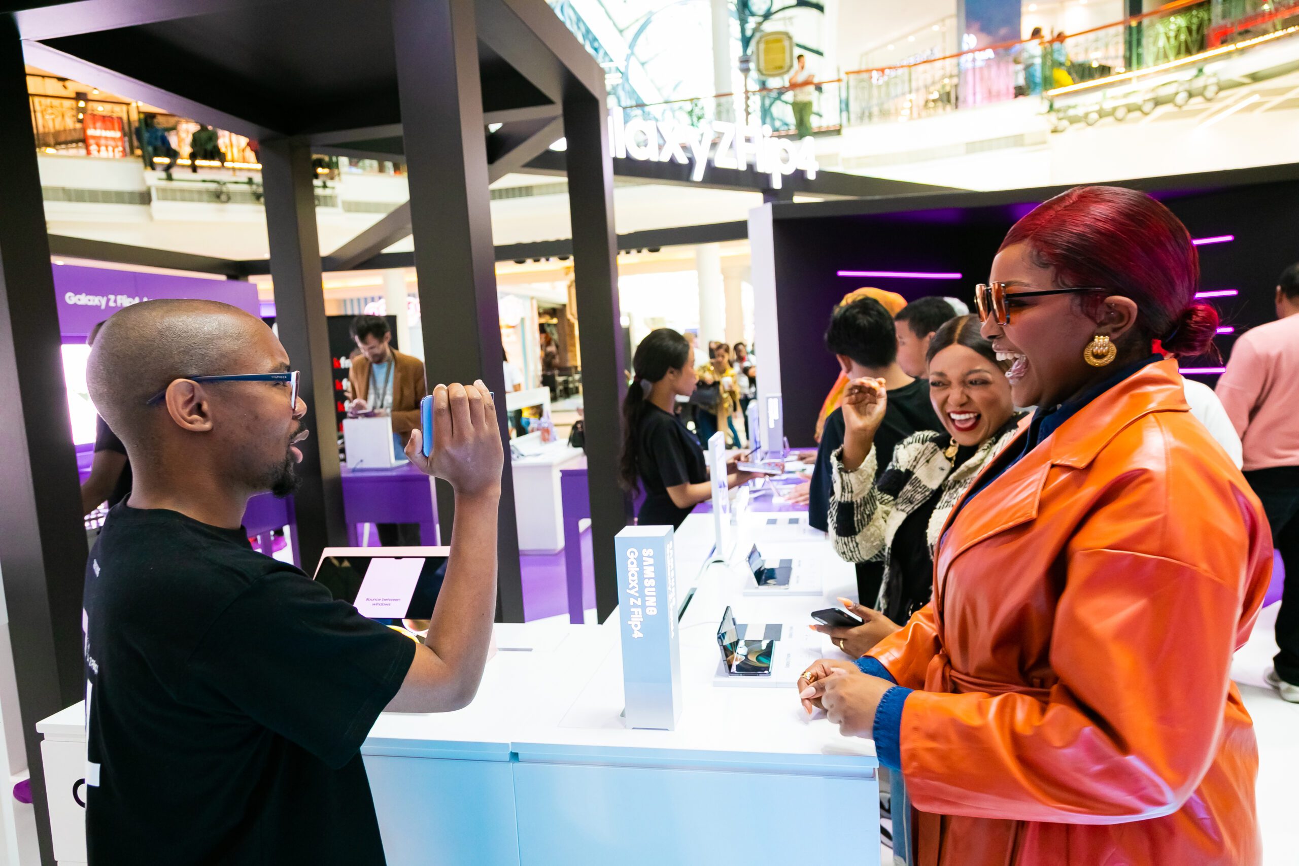
Creating A Color Story For Your Booth
The easiest way to start selecting your booth colors is to work with your existing brand colors. These colors are recognizable and help people connect with your company. However, you can use them in coordination with other colors for a bigger impact. As a trade show booth is essentially a room, most of the color design principles follow interior design color theory. A common rule in interior design is to use a 60-30-10 rule, meaning 60% of the space should be your primary color, 30% your secondary color, and 10% accent colors. When deciding on your brand colors, you will want at least three for maximum impact.
The Basics Of Color Psychology In Booth Design
Different colors trigger different psychological responses in the human brain. Understanding these different responses can help you select booth colors that reflect your brand identity and complement your existing brand colors. Here are the basics of color psychology:
● Red: Energetic and passionate
● Orange: Vibrant and playful
● Yellow: Bright and optimistic
● Green: Serene and refreshing
● Teal: Cool and lively
● Blue: Calming and trustworthy
● Purple: Elegant and upscale
● Pink: Soft and compassionate
● Tan: Natural and warm
● Brown: Modest and grounded
● Black: Timeless and strong
● Grey: Neutral and balanced
● White: Sleek and pure
The colors you choose for your booth depend on the message you want to communicate at the trade show.
Matching Colors For An Engaging Trade Show Booth Design
Color matching is a strategy to combine hues to create visually appealing and harmonious designs. An effective color scheme communicates professionalism and reinforces the intended mood and branding behind the design. Here are some common approaches to color matching:
● Analogous Colors: Colors located side by side on the color wheel, like green, blue, and teal, promote a soothing, harmonious effect.
● Complementary Colors: Opposite pairs on the color wheel, like red and green, create high contrast and bold energy.
● Triadic Colors: Three evenly spaced hues on the color wheel, like red, yellow, and blue, offer a balanced and creative look.
● Monochromatic Colors: Variations of one hue deliver a minimalist, sophisticated appearance.
● Split-Complementary Colors: A base color and its adjacent complements provide visual interest with moderate contrast.
If you aren’t sure where to start, helpful tools like this automatic color wheel can help.
Choosing the right colors will help you get the most out of your booth design. Our exhibit design team will show you how to incorporate color into your booth design to make a lasting impression. Contact Lighthouse Exhibits to get started designing your eye-catching booth.
